
Story Hook:
Too many biotech sites look like data dumps. But what if the design actually helped users understand the science and trust it?

Timeline
Before:
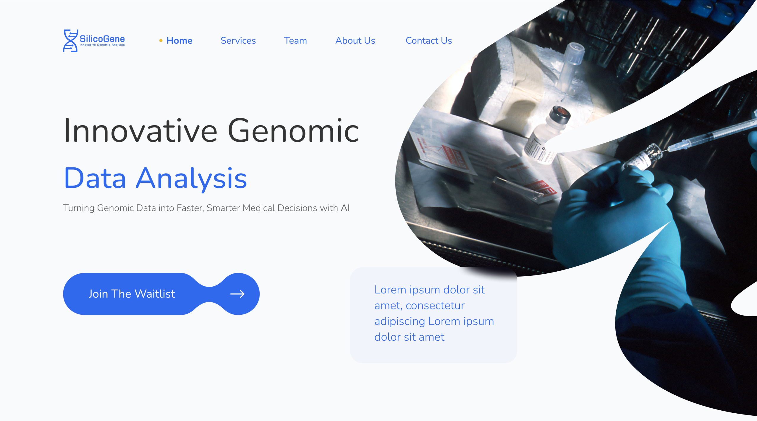
SilicoGene had groundbreaking AI-bioengineering tech, but a basic, unengaging website that made it feel like just another startup.
Then:
We reimagined their digital presence. Science became story. Data became design. Users didn’t just scroll, they understood.
Now:
SilicoGene has a sleek, clear, and trust-building website that speaks to scientists, partners, and investors alike, turning curiosity into connection.
Turning Point
We realized we had a big problem when…
🔵 “Researchers said they had to re-read key sections multiple times just to get the basics.”
🔵 “Investors asked, ‘What exactly do you do again?’”
That’s when we knew: the design wasn’t supporting the message. It was blocking it.
The conflict?
We had to move fast, simplify wisely, and avoid over-simplification.
We could’ve gone with a standard template.
✔️ It’s cheaper.
✔️ It’s faster.
But instead, we dug deep into the science and audience needs.
So, We must create a brand that matched their innovation.
Teachable Moment
Design isn't just about how it looks. It’s how clearly it speaks. Especially in high-stakes industries like biotech, clarity is credibility.
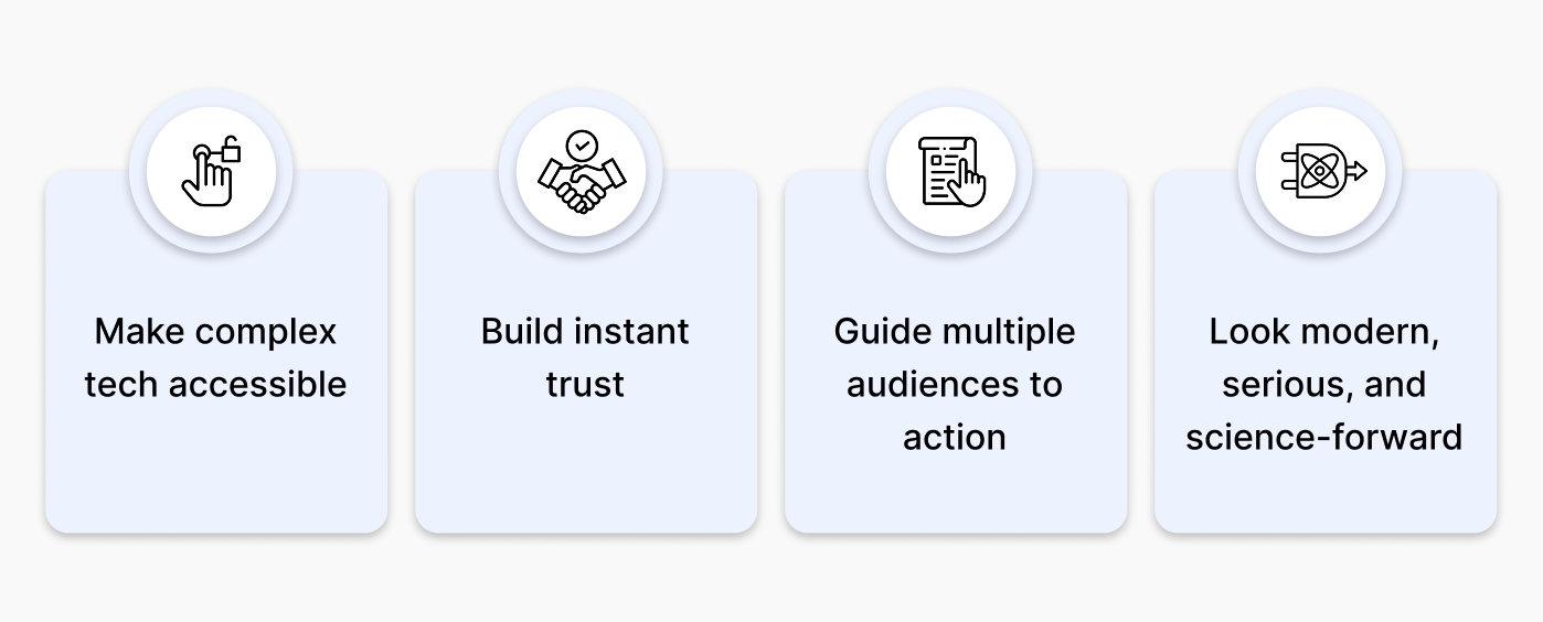
What we actually want?
SilicoGene needed a site that matched their ambition:
How it started
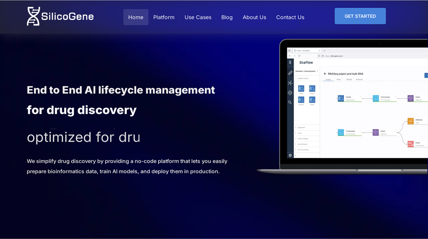
We began with a deep dive into SilicoGene’s mission as an AI-powered, no-code bioengineering platformو designed for health‑tech teams. From interviews and stakeholder sessions, we distilled the need to:
- Simplify the platform’s drag-and-drop MLOps interface.
- Showcase on‑demand GPU compute, omics data pipelines, and AI monitoring.
- Build trust via HIPAA-compliant infrastructure, AWS/Google/NVIDIA partnerships, case studies, and team expertise.
How it continued
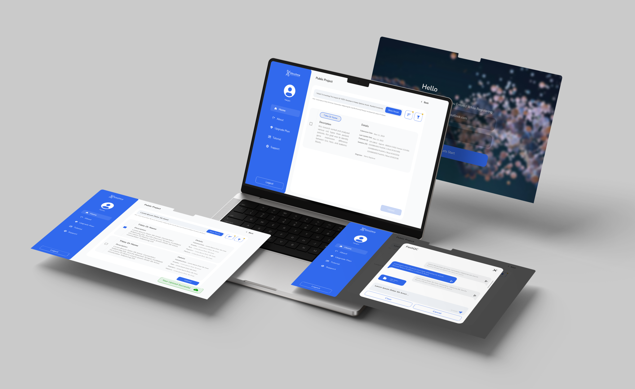
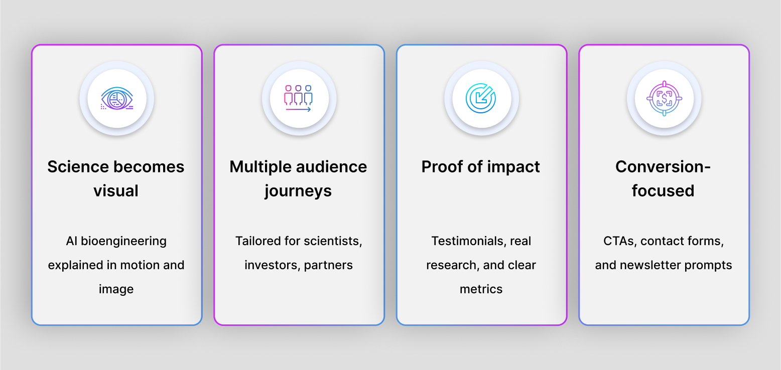
With clarity at the core, we structured content into role-based journeys:
-
Scientists: In-depth breakdowns of genomics/proteomics pipelines
-
Developers: MLOps details like model versioning, auto-scaling, deployment
-
Decision-makers: Emphasis on time-to-market, scale, security, and cost
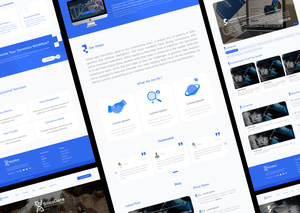
Wireframes visualized dynamic sections: interactive hero, EkaFlow feature overview (drag‑&‑drop UI, GPU scaling, ETL workflows, monitoring), and Request Demo CTAs placed at conversion points.
What’s different now 🤩
We made the story clear. The right people find what they need fast, whether it’s proof, purpose, or a way to get in touch.
Now, each audience gets a clear path. Scientists see the tech, investors see the impact, partners see the potential. Everything feels purposeful, from the visuals to the calls to action. No guesswork, no clutter! just clarity.
How it felt on the other side
Clickable prototypes were tested with:
Researchers, to validate content clarity on omics workflows
AI engineers, to test UX around GPU selection, ETL flow design
Business stakeholders, to ensure messaging resonated and CTAs triggered inquiries
Feedback led to refinements:
Cleaning content blocks
Emphasizing “focus on research, not engineering”
Highlighting “pay-as-you-go” model directly beneath GPU/scale visuals
“Way easier to scan than other biotech sites.”
“I reached out after 2 minutes; everything just made sense.”
“It doesn’t talk down to you or overcomplicate things. It respects the reader, whether you’re technical or not.”
What changed
- User engagement jumped by 40%.
- Visitors stayed longer, explored deeper, and left with clarity thanks to focused visuals and intuitive structure.
- Inbound interest from researchers, investors, and partners grew fast, and the quality of conversations improved because people finally got what SilicoGene does.
- The brand now shows up as what it truly is: a biotech innovator.
And behind the scenes?
A clean, scalable design system is in place built to grow with them.
Alright… What’s Next?