Qtime – Simplifying TV series discovery with personalized recommendations and effortless content tracking
Role: UX/UI, web architecture, multi-audience UX, strategic content
Industry: Entertainment, B2C
Platform: Mobile
Date: 2022
Tired of scrolling for your next show?
Imagine never wasting time scrolling through endless lists again. Learns what you love, serves up spot-on recommendations, and keeps track of every episode you’ve watched, so you can spend less time searching and more time watching.
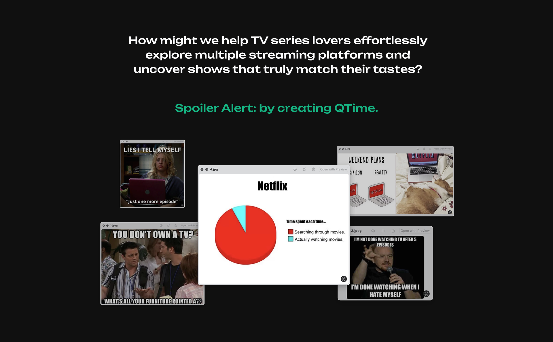
The origin story...
With over 817,000 TV shows spread across 200+ streaming platforms, finding your next binge can feel like searching for a needle in a haystack. No wonder nearly half of viewers say discovering something they actually want to watch is a struggle.
The Big Question 🤔
Choosing what to watch shouldn’t feel like homework, yet so many people get stuck scrolling endlessly, overwhelmed by options, and end up watching whatever’s pushed their way… or nothing at all.
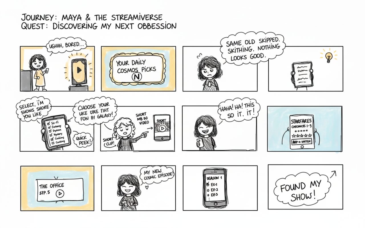
Everything changed when we realized people often find their next TV series while scrolling through Reels or TikTok.
Impact First!
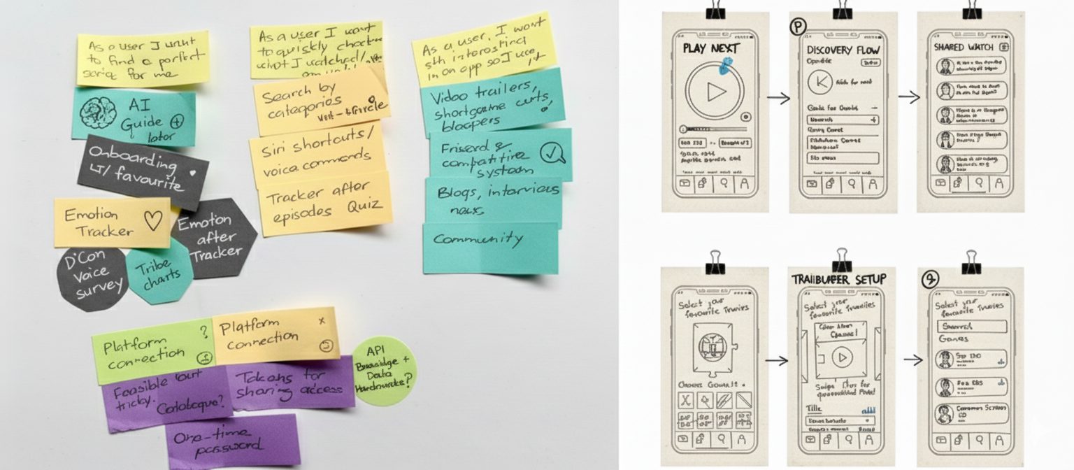
Using visuals helped me truly grasp what users want and made it easy to share those ideas with the team. It turned complicated things into clear, shared understanding.
We chose to focus on features that would make the biggest difference right away. That meant launching with a video feed and easy onboarding first, and saving the more complex platform connections for later.
Because it was an iOS app, we followed Apple’s design rules closely. This made the app feel natural and easy to use from the start and helped us build it faster.
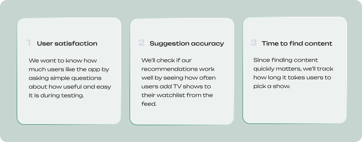
User Signals, Real Metrics 👍
At first, we wanted to know if people would actually like using the app. So, we looked closely at how interested users were during testing.
Next, we’re focusing on making sure the app works smoothlyand reliably once it’s out in the world.
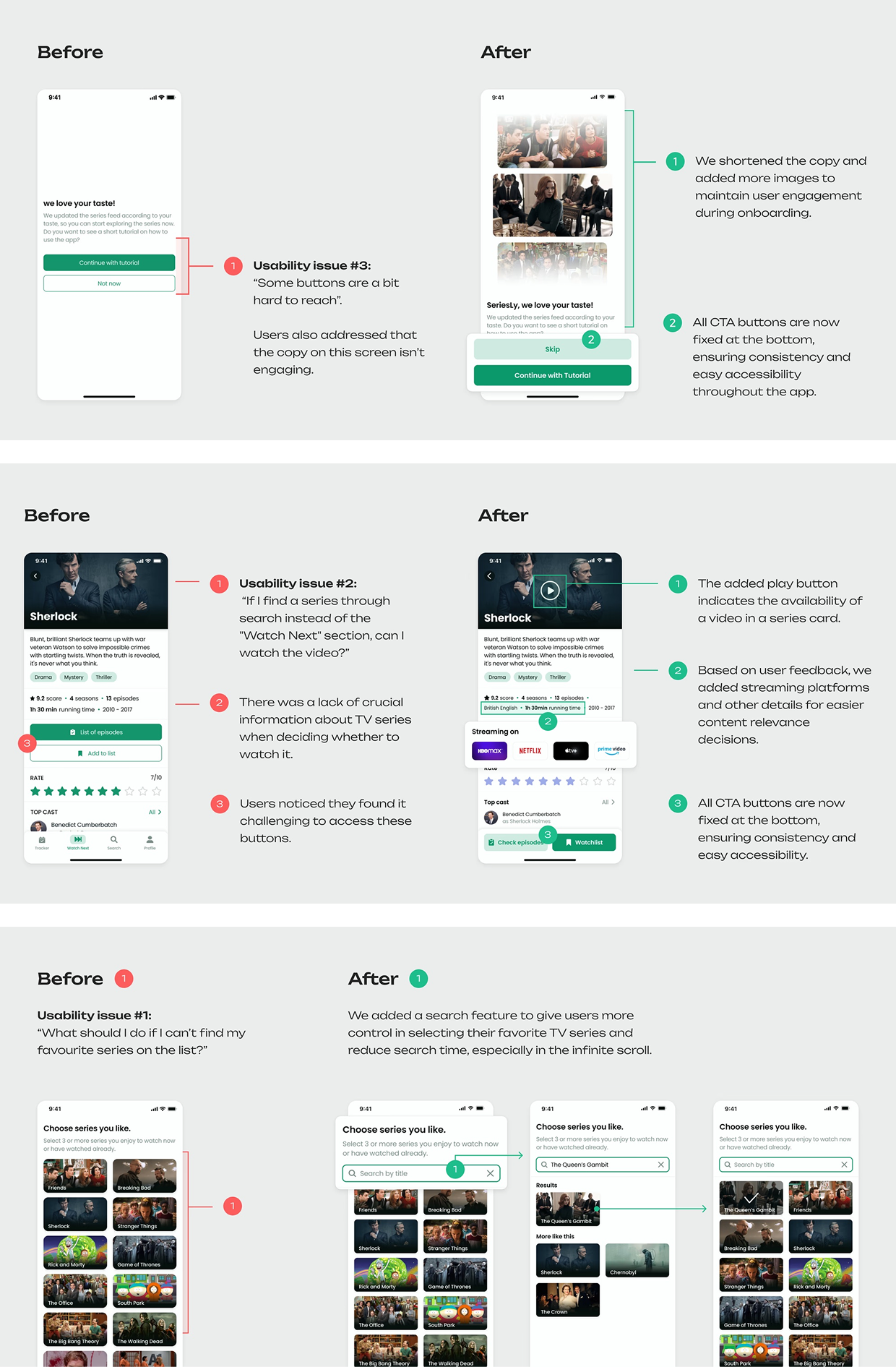
You can't guess What’s Missing?
Viewers struggle to explore TV series easily because they have to switch between multiple streaming apps.
So, creating a personalized feed lets them discover shows all in one place.
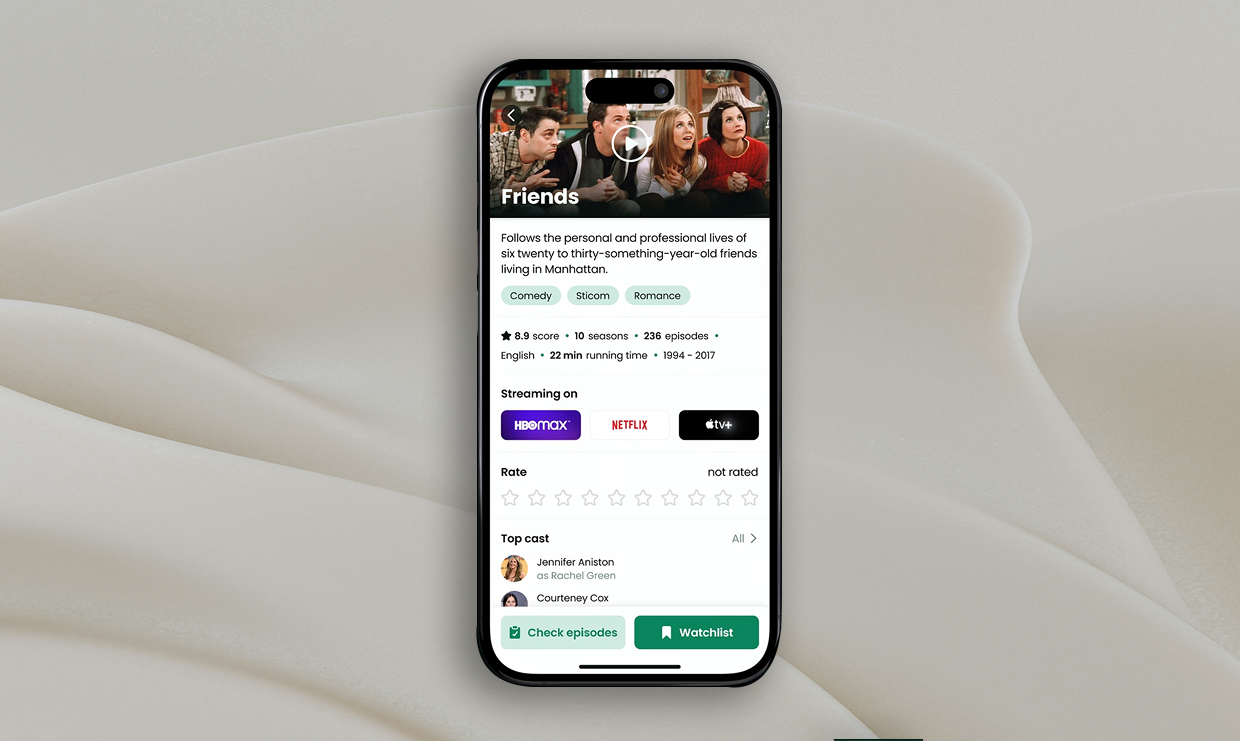
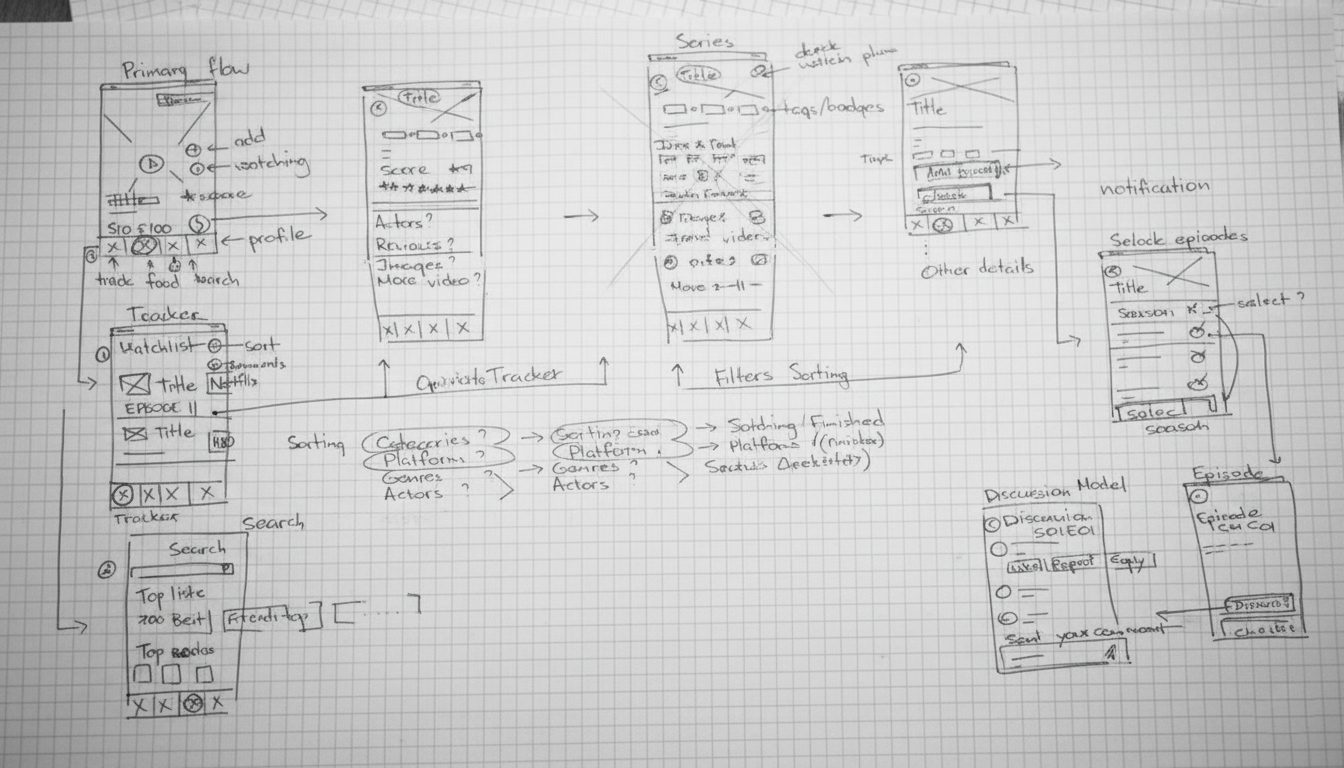
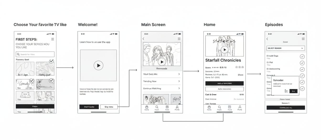
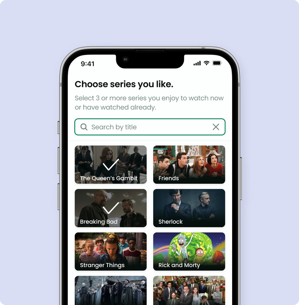
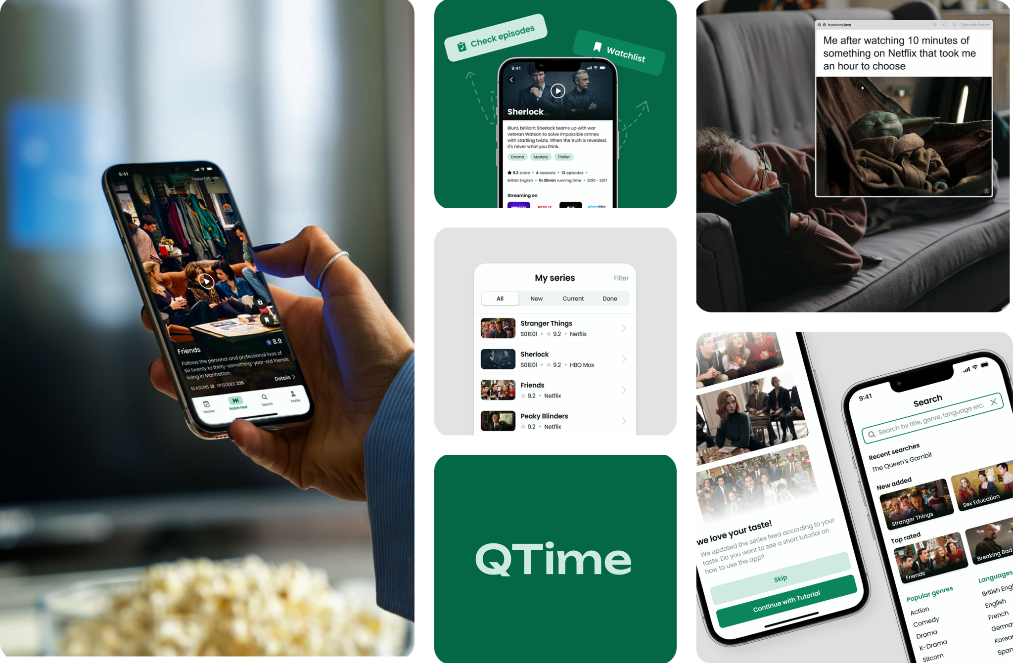
Solution 1:
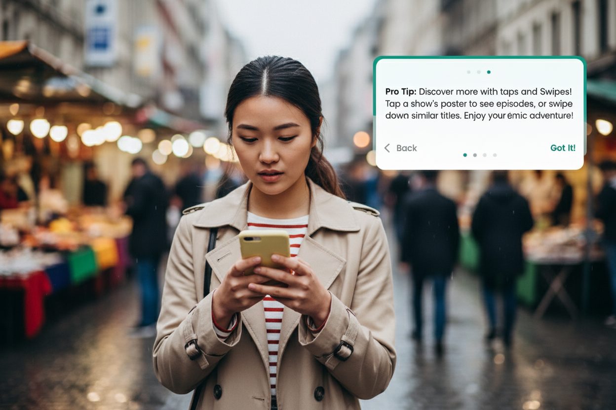
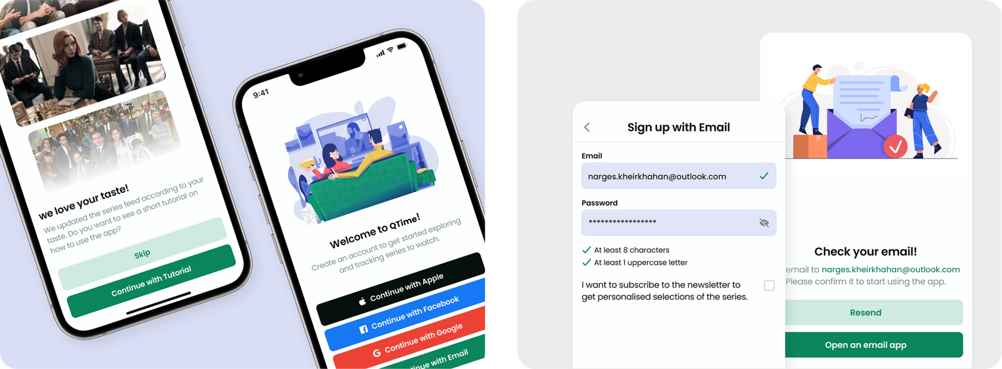
The onboarding process that provides two benefits
✔️ We collect users' preferences during onboarding to customise a series feed and provide personalised suggestions based on their favourite TV series.
✔️ Also the included app tutorial helps users quickly learn how to use the new app and gestures without guessing.
“I want to find a perfect TV series for me”
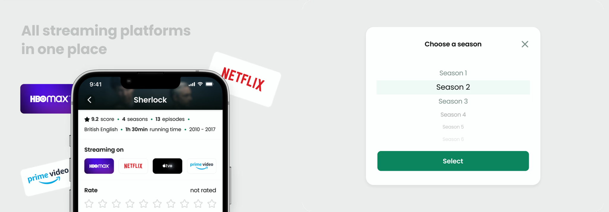
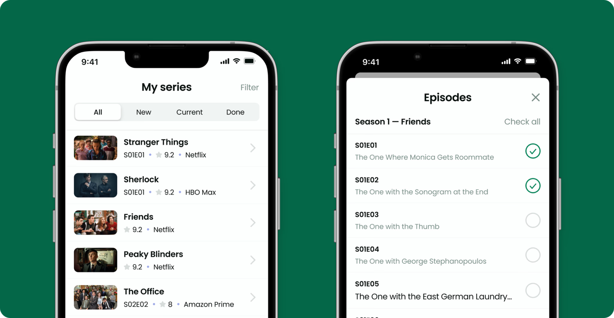
Solution 2:
Keep track of TV series in one app, so you are never lost in your all subscriptions
✔️ We solved the problem of remembering what users watched by allowing users to track series and access a watchlist without switching between platforms.
✔️ Extra bonus is that users can decide which platform is worth subscribing to.
“I want to quickly check what I watched”
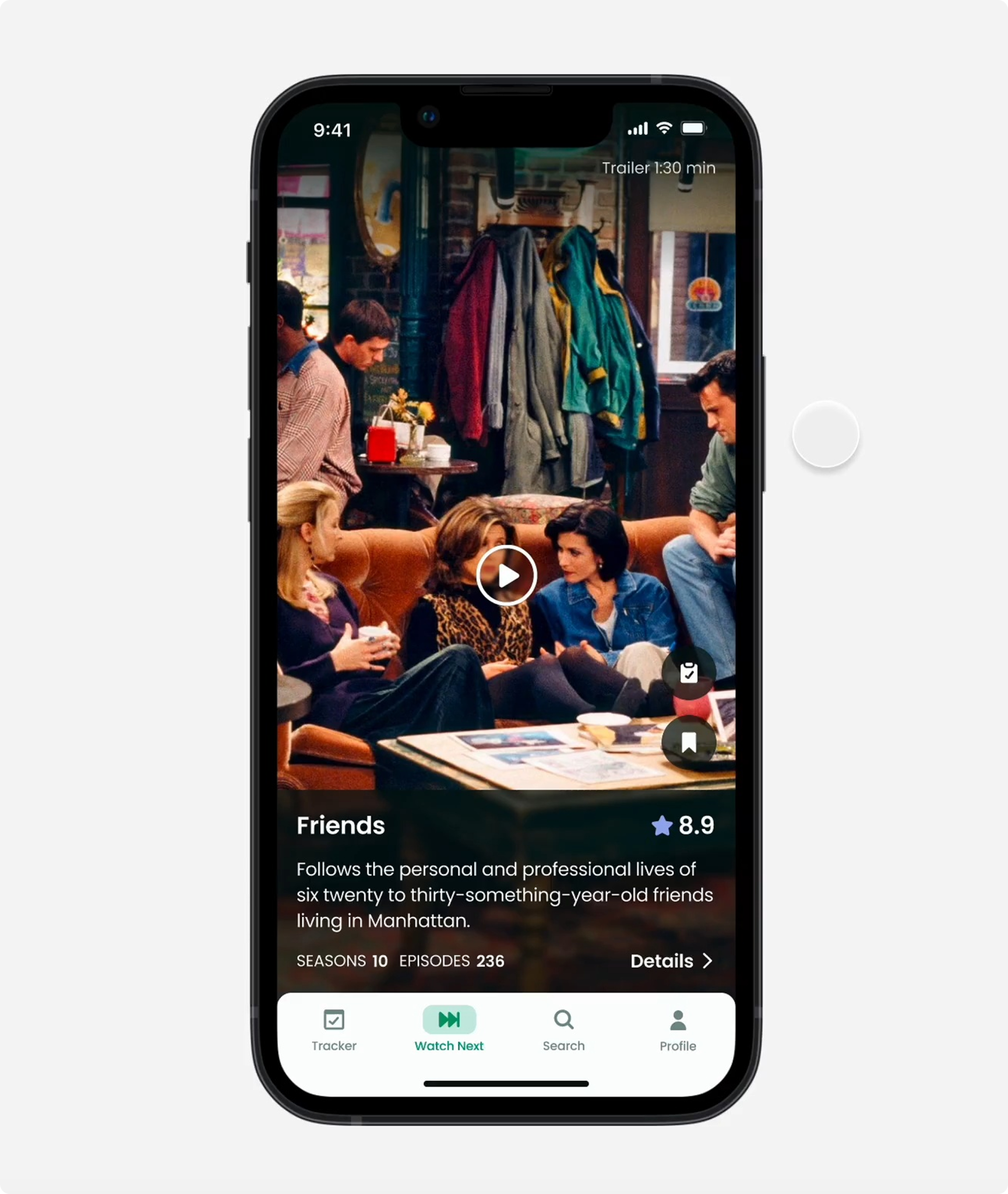
Solution 3:
Engaging videos redefining search exploration
✔️ We enriched TV series’ search experience with a series feed of short videos, scene cuts, and trailers, allowing quick and engaged decisions.
✔️ Users can now effortlessly navigate and discover new TV shows using integrated well-know gestures.
✔️ We included the search with refined categories that reduces overwhelm.
“I want to be actively engaged in the app”
Room to Improve
It wasn’t smooth at first. The initial version revealed a few hiccups that needed fixing.
After refining the design based on feedback, the app grew from just an idea to earning a strong user satisfaction score of 4.6 out of 5, moving confidently into execution.
What would I do differently next time
Next time, I’d bring users in earlier to test functionality, so we can quickly spot what works and avoid spending time on complex prototypes that miss the mark.
I’d also set a clear roadmap from the start to keep the team on track and make progress easy to follow.
What I Learned
Working closely with the dev team in workshops helped us grasp technical limits early and brought fresh viewpoints to prioritizing solutions.
Starting with a design system or component library saves time later and keeps the app consistent and accessible.