DojoHome – Enhancing everyday living through smart home automation and user-centered design
Role: UI designer
Industry: Internet of Things (IoT) / Consumer Technology
Client: DojoHome
Date: 2022
The Challenge
Smart home users loved the idea of automation but hated the reality of managing it. Multiple apps, inconsistent interfaces, and scattered device controls left them frustrated.
For many, setting up or changing a routine felt like solving a puzzle, time-consuming, confusing, and far from “smart.”
The Turning Point
User research revealed a clear insight:
People didn’t just want more features, they wanted simplicity.
They needed one unified place to manage everything, without technical jargon or a steep learning curve. That’s when we decided to completely rethink the experience from the ground up.
Shortcut or Solve?
We faced pressure to deliver quick cosmetic improvements instead of a deeper overhaul. A simple reskin would have been faster, but it wouldn’t have solved the real usability issues that made smart homes feel anything but smart.
Choosing the Harder, Better Path
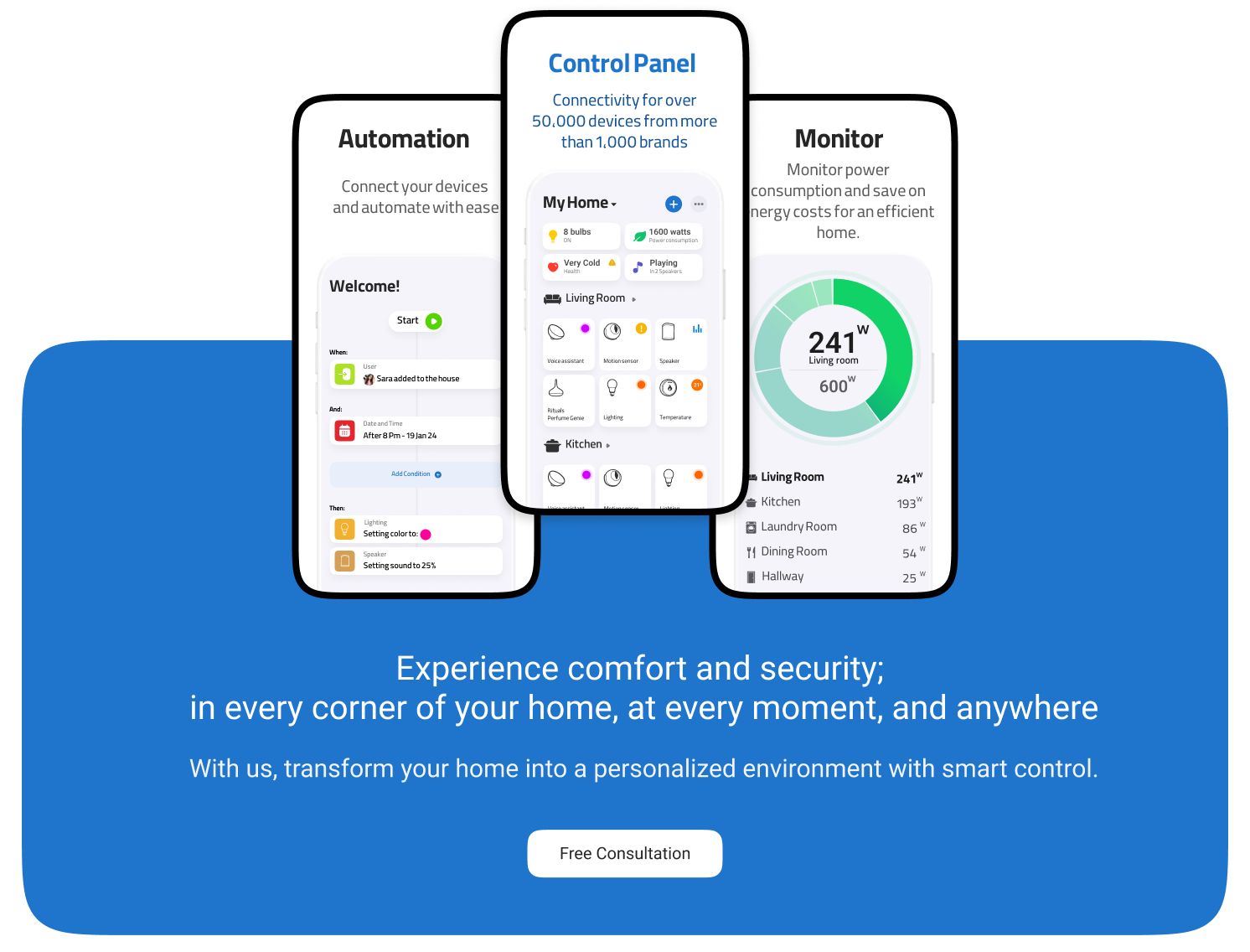
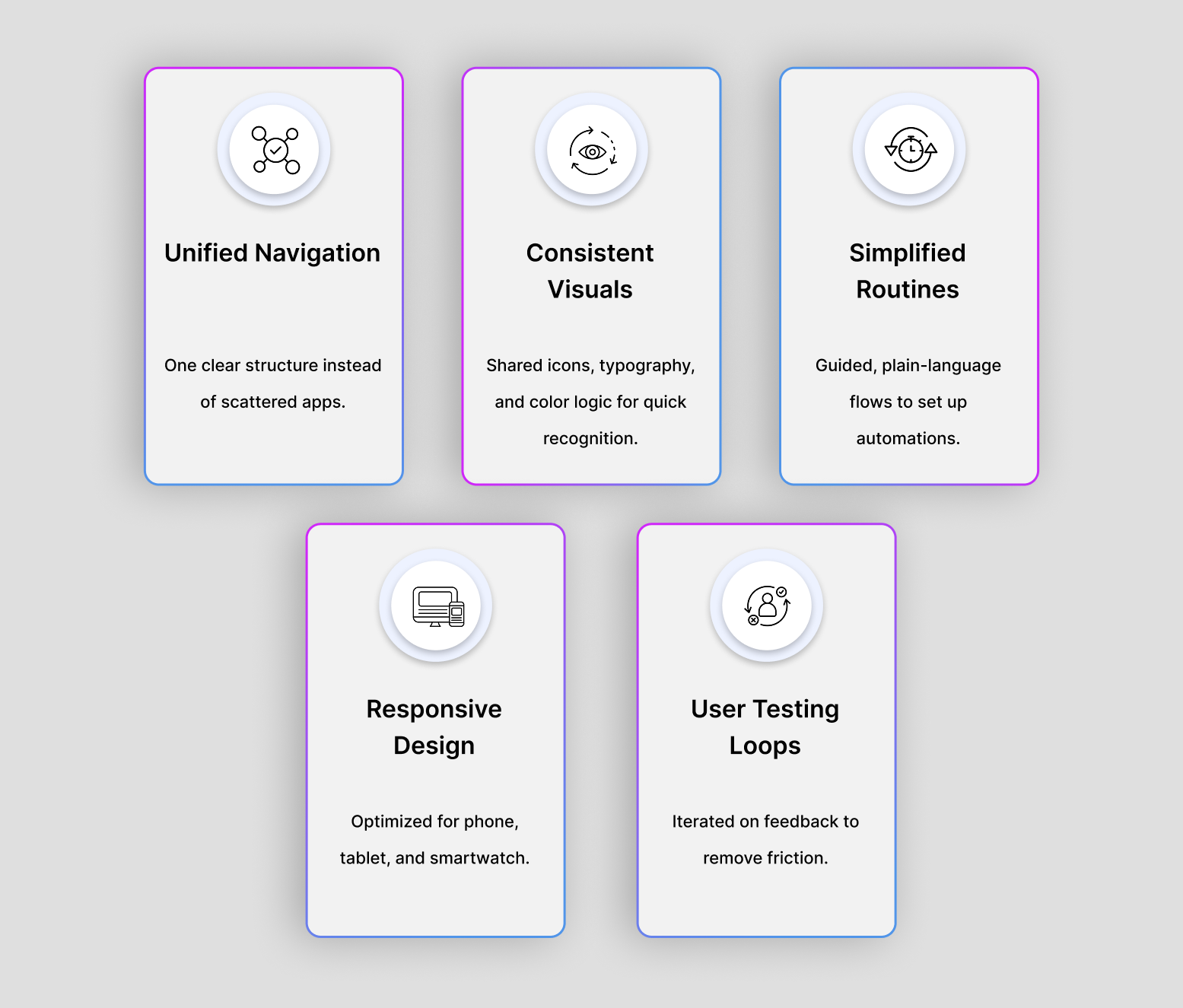
We chose the harder path: redesigning the entire interface architecture. We simplified navigation, introduced a consistent visual language, and made automation setup intuitive for everyone, from tech-savvy homeowners to first-time users.
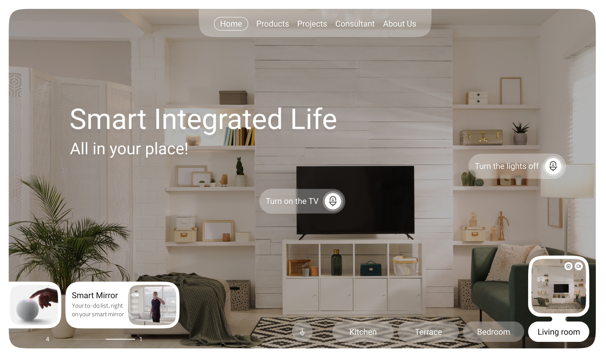
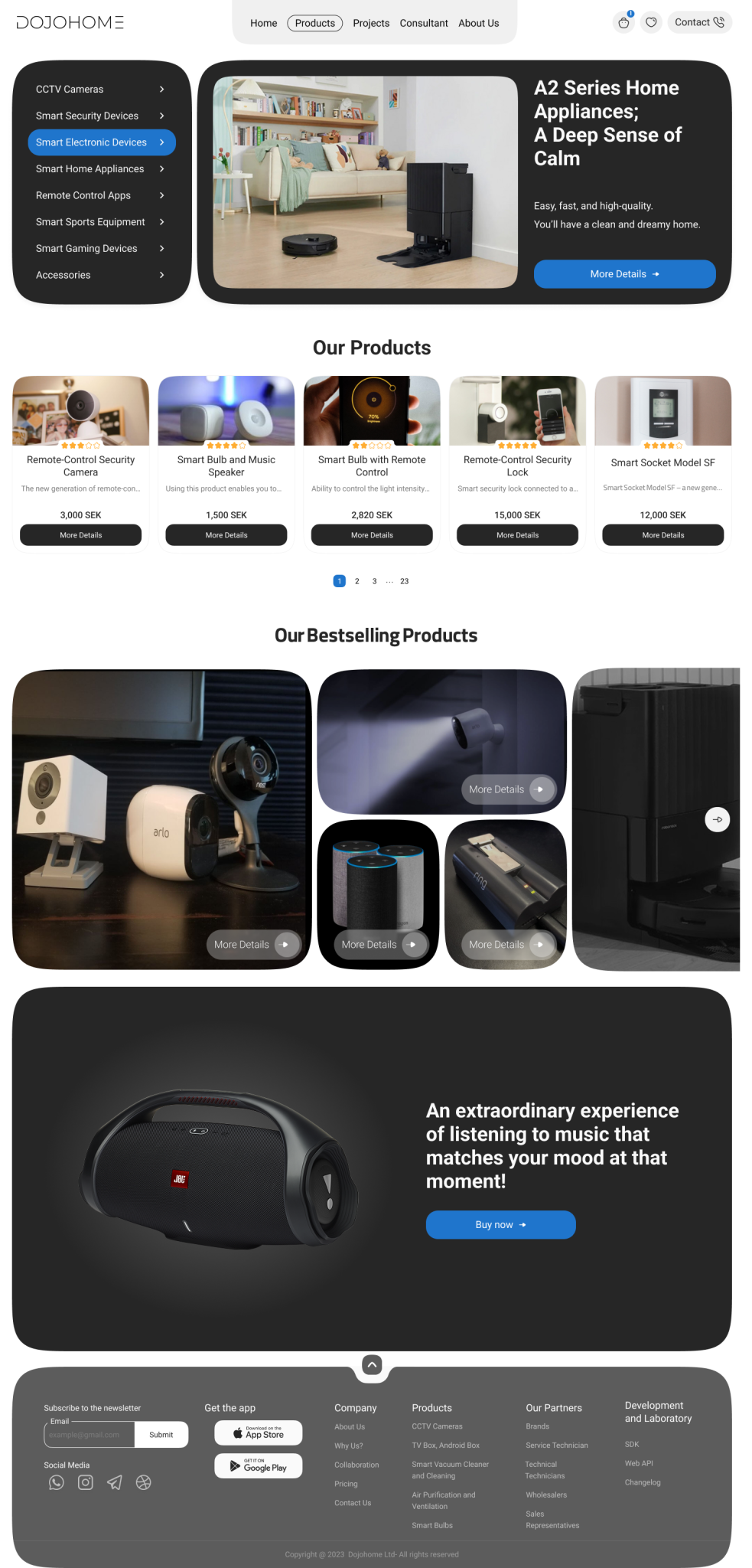
How we made "Smart Homes" truly Smart
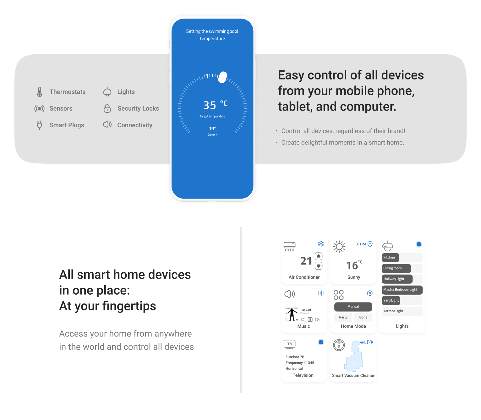
The new DojoHome interface brings every smart device into one clean, cohesive platform. Users can now control, automate, and monitor their entire home effortlessly, whether from their phone, tablet, or smartwatch. Engagement is up, confusion is down, and smart living finally feels… smart.
The result?
An interface that feels less like a control panel and more like a personal assistant, fast, intuitive, and finally worthy of the word “smart.”