PayPal – Improving P2P transaction through introducing transparent fees and efficient payment flow
Role: UX/UI Designer
Industry: Fintech
Date: 2024
Platform: IOS and Android
What did we do?
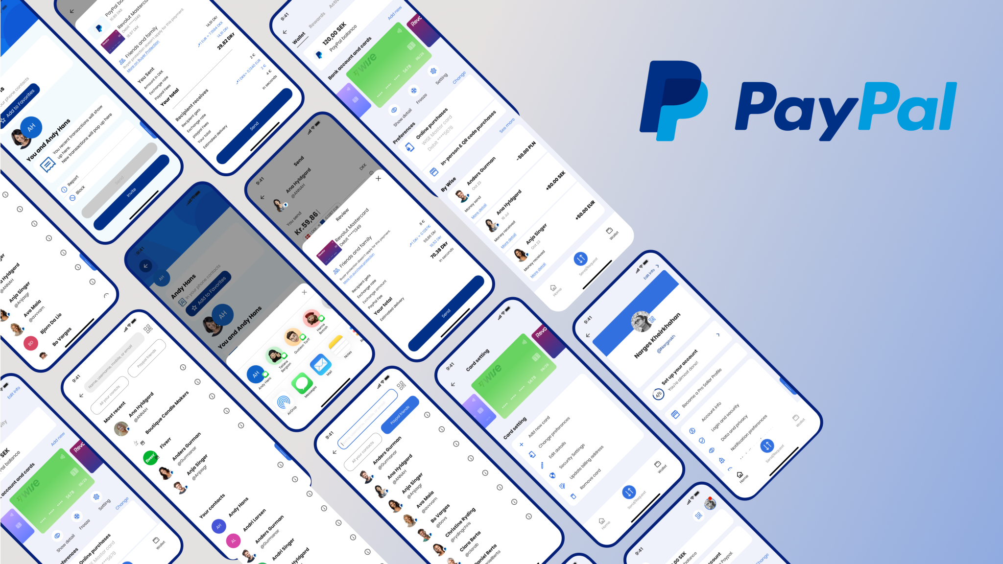
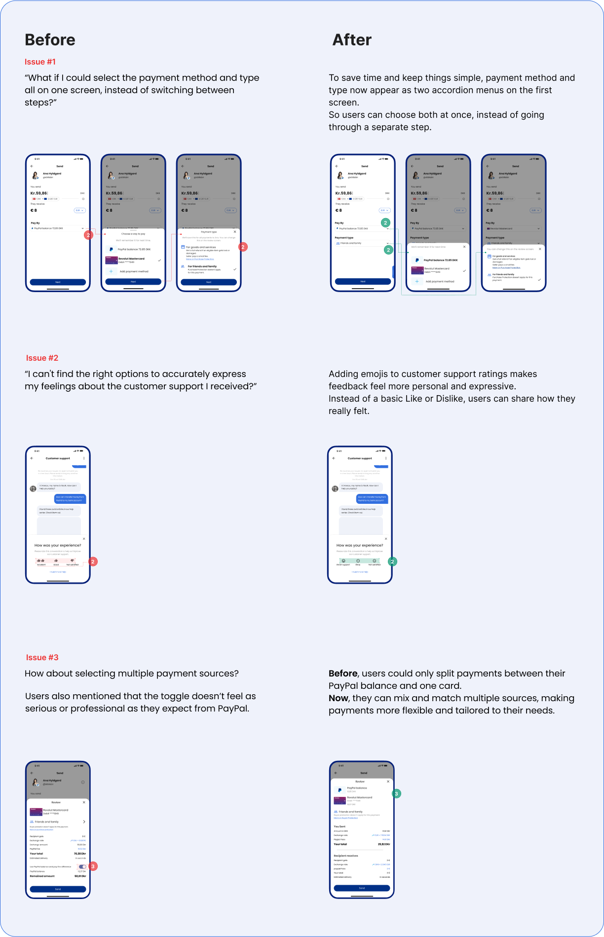
We enhanced PayPal’s P2P transaction process by increasing transparency and simplifying the steps to make it more straightforward. We redesigned the app to speed upthe process and improve transaction efficiency.
How it started…
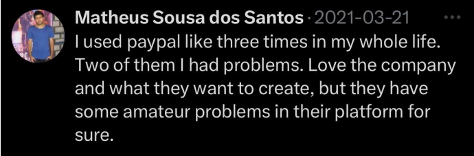
A single tweet sparked our journey to uncover if there’s a real issue with PayPal.
We decided to dig deeper
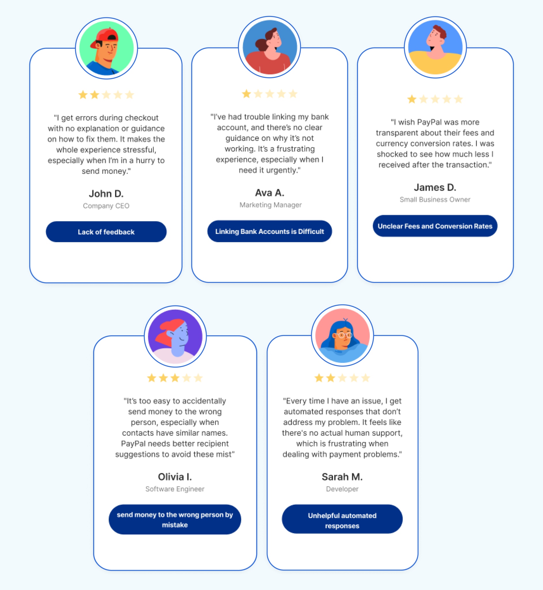
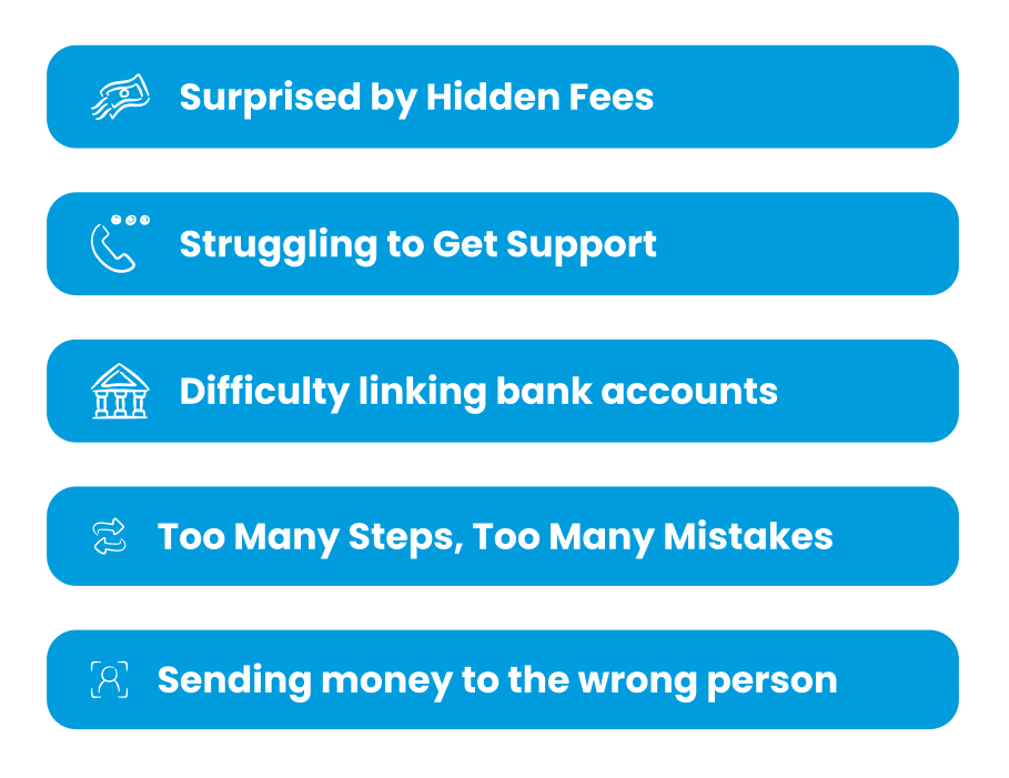
While PayPal is known for its simplicity and security, it struggles with limited guidance, challenges in linking bank accounts, unclear fees and conversion rates, and the risk of sending money to the wrong person. Additionally, the automated customer support provides little assistance.
When it comes to money, people expect every interaction to be clear, reliable, and stress-free.
What we needed to know
Who uses PayPal’s P2P services, and how often?
What challenges do users face when completing transactions?
What alternative apps do users prefer, and why?
Why do users abandon a transaction midway?
How do users feel about contacting PayPal support?
How do users feel about the clarity of PayPal’s fee structure?
People who’ve used PayPal for a few years want clear information about fees. They like it when the app is simple, fast, and helps them feel in control, especially when sending money abroad.
What we found 🤔
Users face unexpected friction that disrupts their flow and confidence. This creates hesitation and reduces their overall satisfaction, limitingengagement.
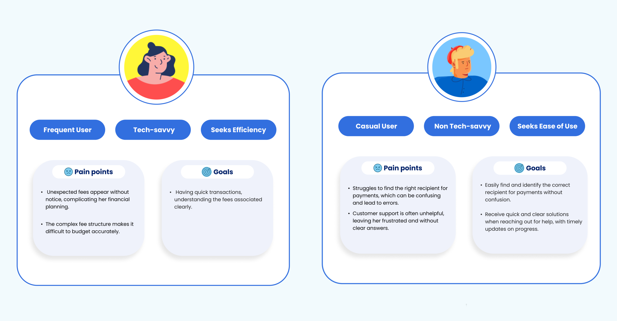
Who leaves and Why?
Two very different people face their own challenges and have unique needs. Their priorities reveal where real impact happens and what we should focus on.
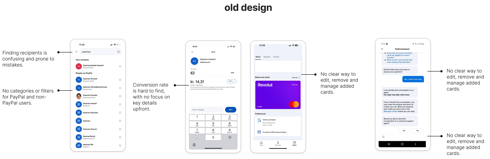
Looking at what exists
Users are already trying to make things work with what’s available but they often feel stuck, frustrated, or let down.
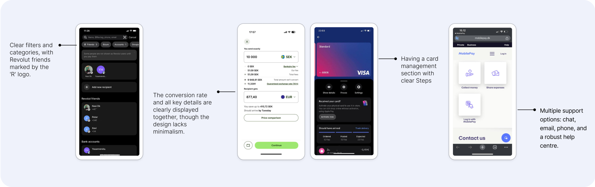
What’s already out there 🧐
PayPal’s peers face similar challenges! some meet user needs with clarity, others fall short. These patterns reveal what users expect and where there's room to do better.
The peers prioritize simplicity and transparency with intuitive navigation, clear information display, and multiple support options.
The real struggle
We looked at what existed and how others handled similar issues. From this, a clear question came up that helped us focus and think in new ways. It showed us a better path forward.
We focused on ideas that could make the biggest difference. Bringing different perspectives together helped us find the most valuable solutions faster.
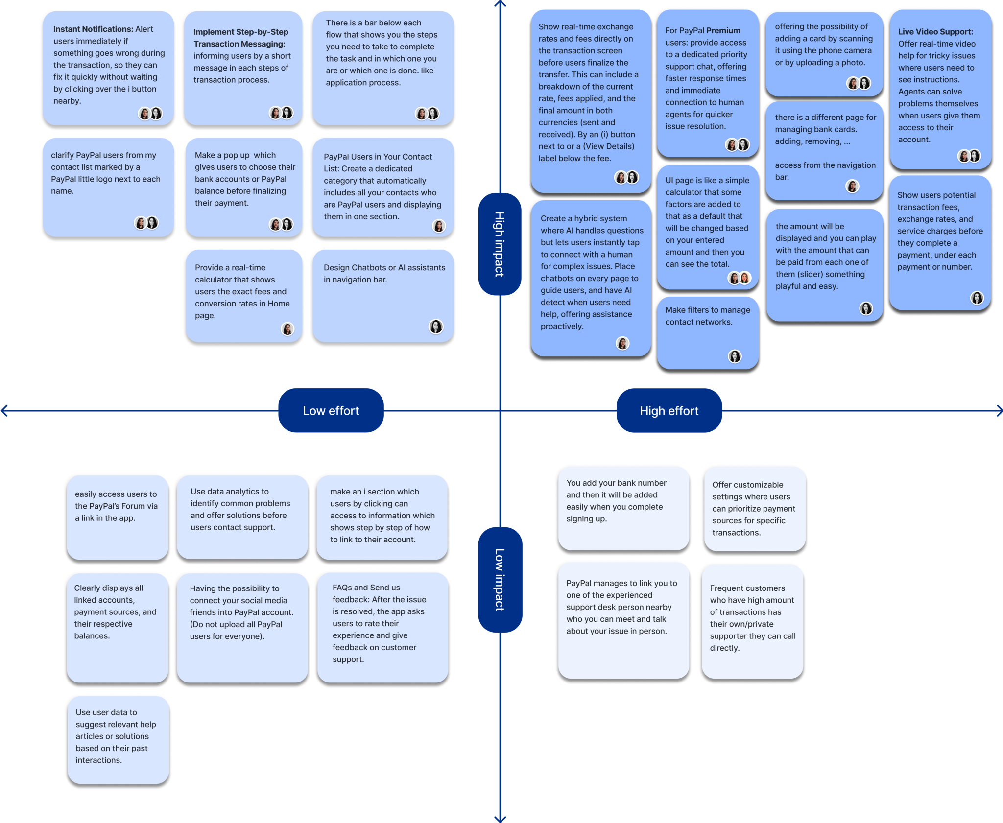
Turning challenges into solutions
We approached each challenge as a chance to think differently.
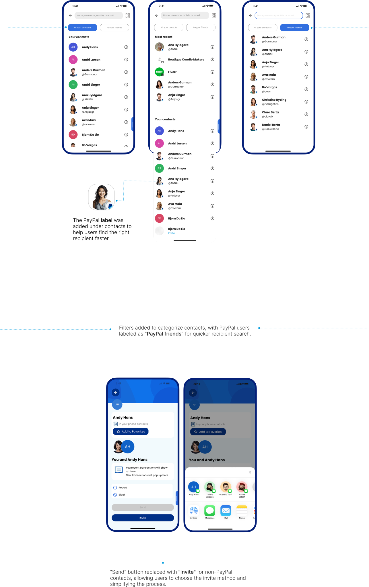
Solution 1:
Simplifies this with categorized contacts, smart suggestions, and a dedicated filter for PayPal users, making the process seamless and stress-free.
“I want to find the person I’m paying quickly without any hassle.”
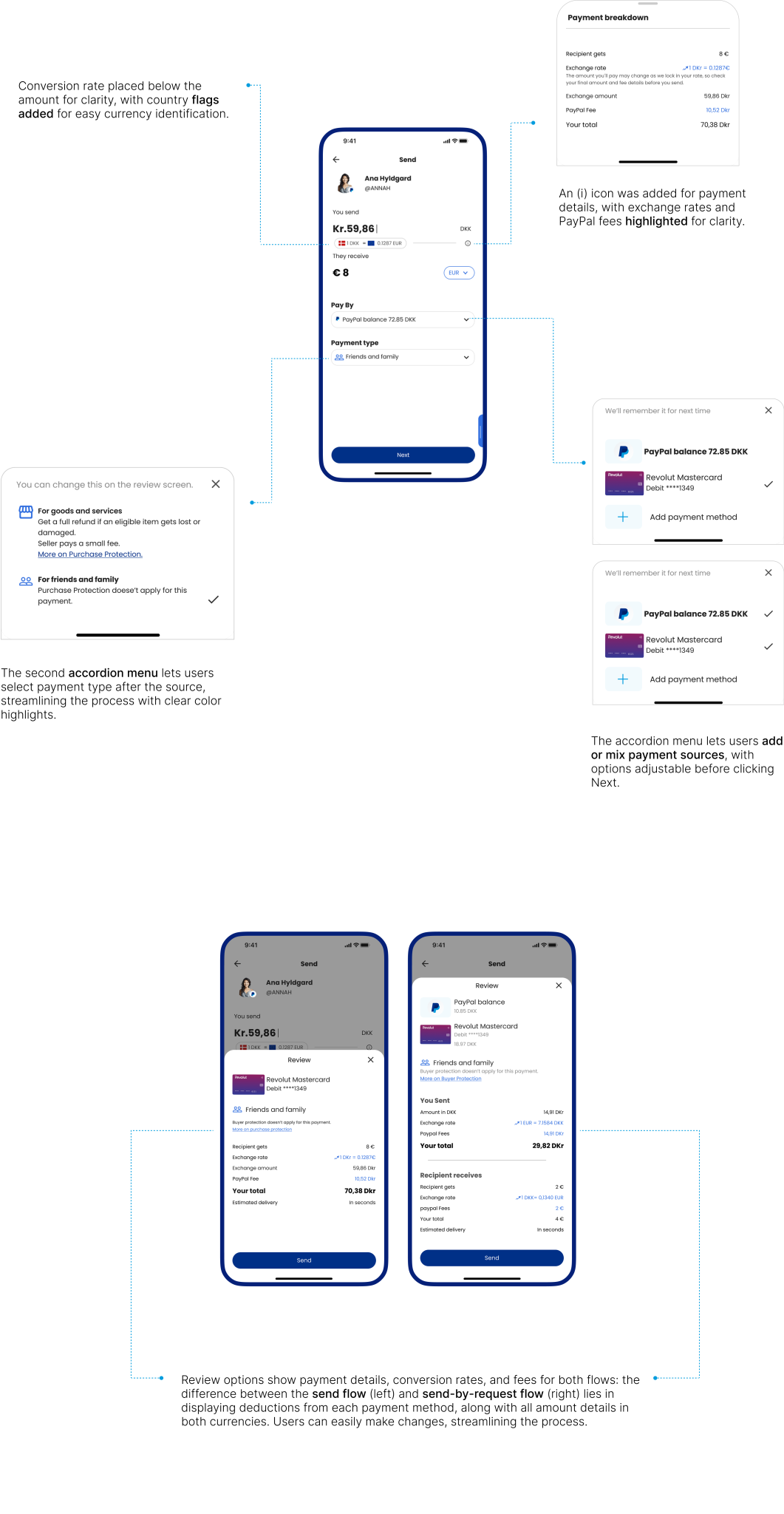
Solution 2:
A detailed summary shows live exchange rates, transparent fees, and the exact amount the recipient will receive; all before confirming the transaction.
“I want to know exactly how much I’m sending and what it will cost me.”
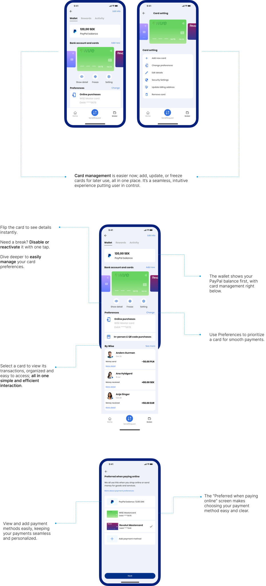
Solution 3:
Integrates card management into the wallet, allowing users to link bank accounts, manage payment methods, and update preferences effortlessly in just a few clicks.
“I want an easy way to link my accounts and keep my payment options organized.”
Solution 4:
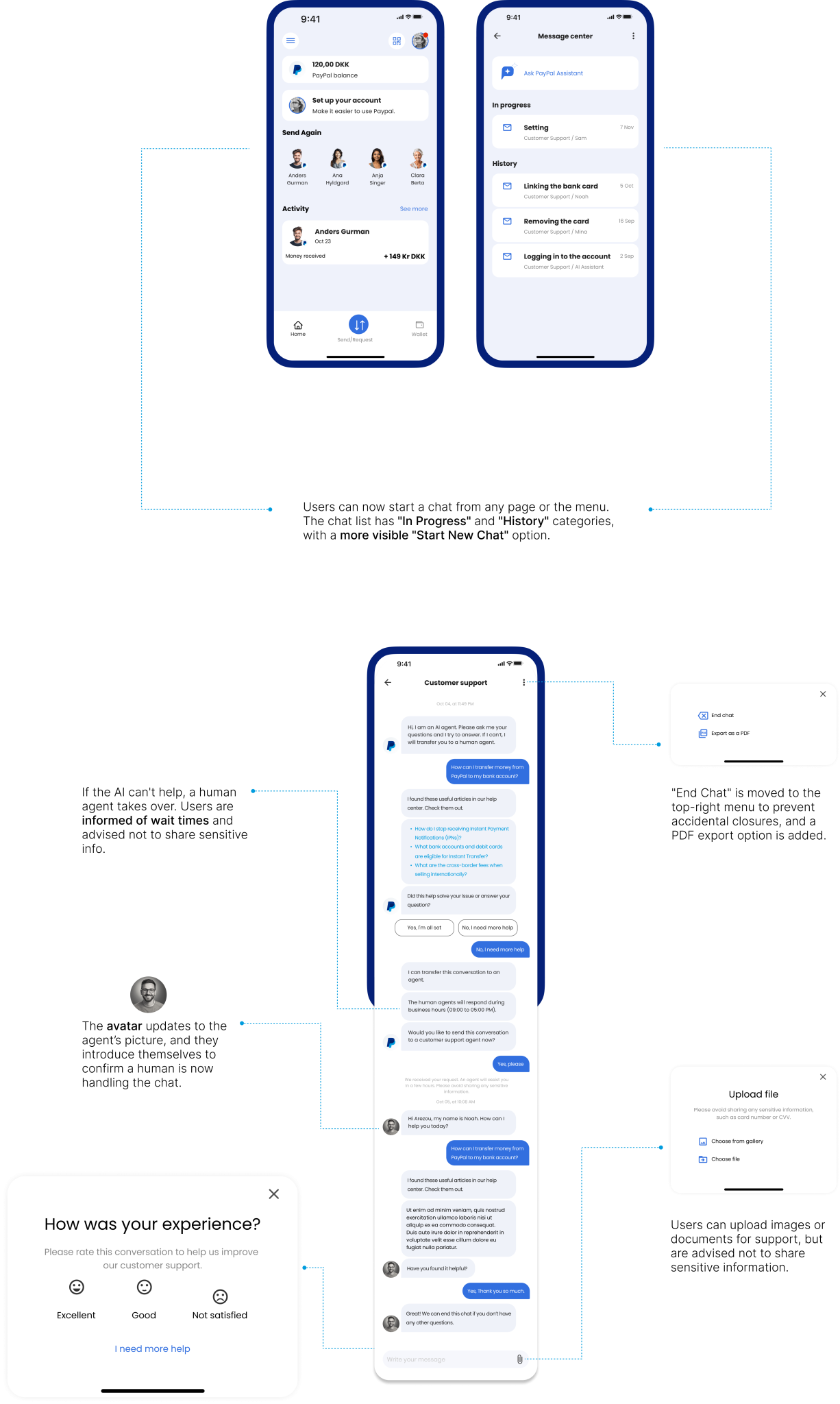
A support system with instant chat access, categorized issues for faster navigation, and an intuitive help center that solves problems effortlessly.
“I want quick and easy support when I face an issue.”
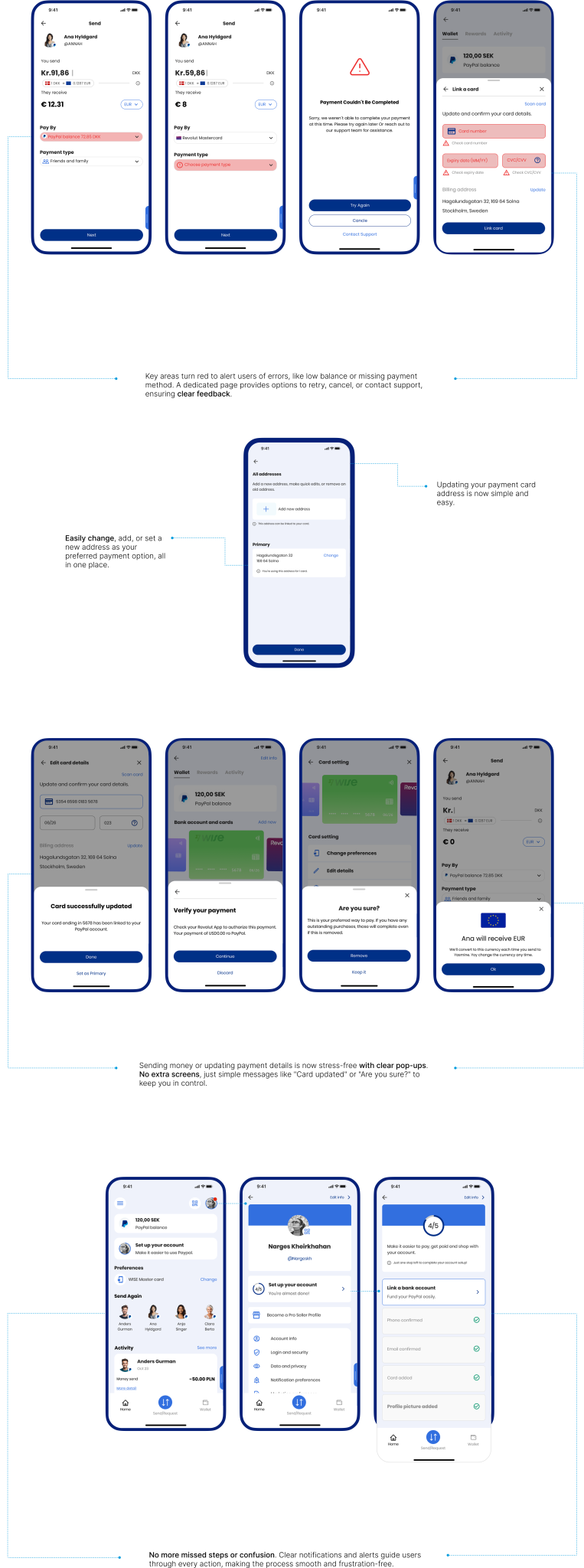
Solution 5:
Delivers real-time alerts with straightforward instructions, ensuring users are informed of any issues or missing steps, making the resolution process quick and easy.
“I want clear guidance when issues arise or steps are missed.”
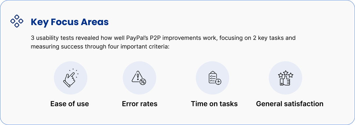
Did we solve the problems?
The changes we made really improved what existed, and we felt we were getting closer to our goals. The transaction process now feels clearer, making the payment experience better.
But, are we really getting it right? Let's test!
Refining What Matters
Users showed us where things felt confusing or limiting. We made key changes that simplify actions, reduce friction, and better matchwhat they need in the moment.
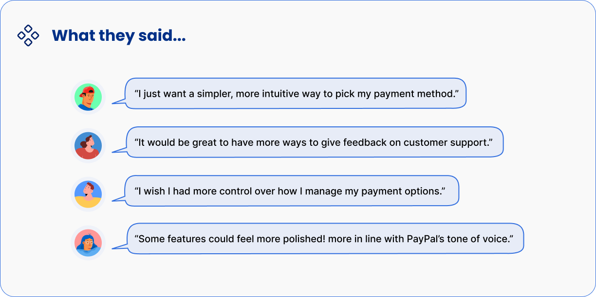
And guess what?
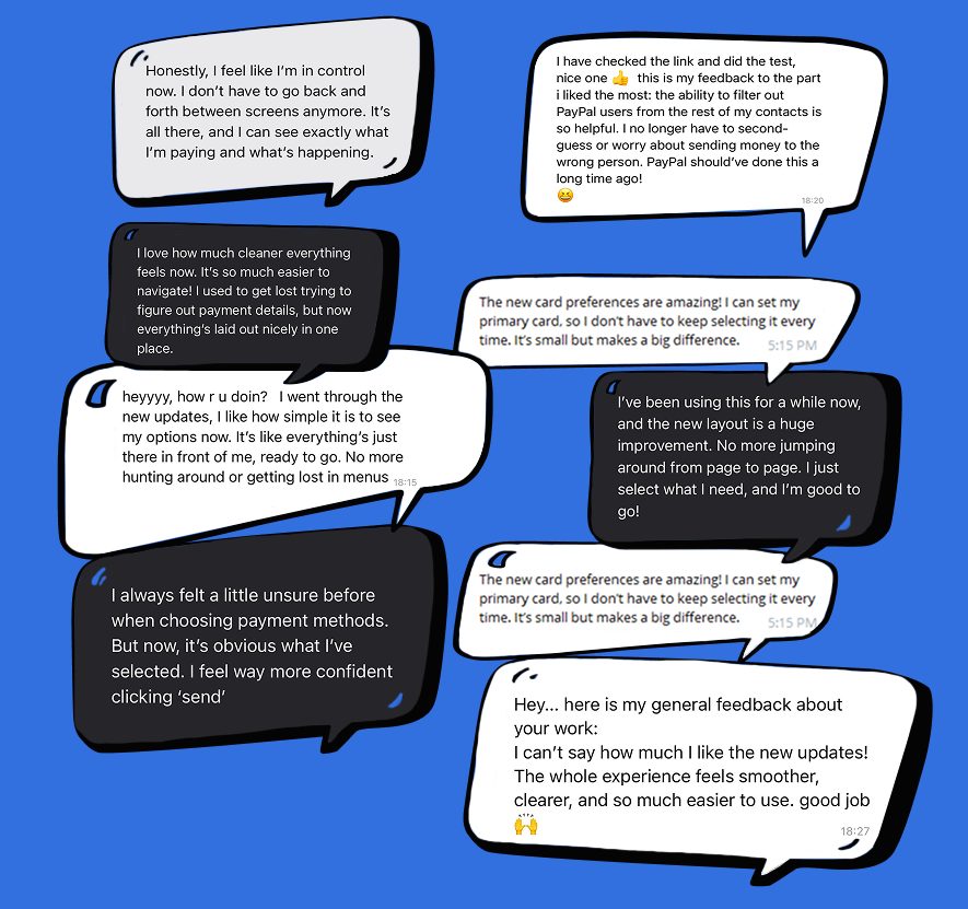
we were surprised by what users told us 🎉
Users are excited about the updates, feeling more confident, secure, and supported with PayPal’s latest improvements!
What we've learned:
- Fee transparency
Users just want to know what they’ll pay. No surprises. Hidden fees break trust. Keep it simple, clear, and upfront. It makes all the difference.
- Clear customer support is key to building trust in financial apps:
When it comes to money, support matters. Users need to feel heard, helped, and confident their concerns are handled with care.
- PayPal efficiency is missing on P2P experience:
In digital payments, speed and ease aren’t optional. They’re expected. Users want quick, simple transactions they can trust. A smooth experience keeps them coming back.
What would we do differently next time:
– Test early with real users to quickly validate ideas, no need for complex prototypes right away. It saves time and sharpens the design.
– Add simple personalization. Let users choose how they view fees or tweak their payment flow. Small touches, big value.